Another Perfect Recession Indicator
Barry Ritholtz at the Big Picture is on to something. He has found A Perfect Recession Indicator. Since 1953, when year-over-year Non-Farm payrolls have gone negative, there has been a recession. This happened nine out of nine times for a perfect score! (I actually looked at the data from 1939 and it scores two other direct hits in 1944 and 1949 making it 11 for 11 in calling recessions. That’s pretty impressive, Barry.)
I have one other perfect indicator: continuing claims. This series go back to 1967. So, I’m only six for six. Whenever (4-week average) continuing claims rise more than +200,000 in a year’s time, you get, well you know….recession!
- On 10 Jan 1970, 3 months after the recession began, average continuing claims had jumped +211,250 in a year. Year-on-year comparisons went up to +1,128,000 on 28 Nov 1970 and stayed above +200,000 until 11 Sep 1971.
- On 12 Jan 1974, right when recession began, average continuing claims had jumped +221,750 in a year. Year-on-year comparisons stayed above +200,000 for 23 months until 13 Dec 1975. They peaked at a gargantuan +2,529,000 on 17 May 1975.
- On 13 Oct 1979, 6 months before the recession began, average continuing claims had jumped +209,000 in a year. Year-on-year comparisons stayed above +200,000 for 15 months until 31 Jan 1981. They peaked at +1,583,000 on 28 Jun 1980.
- On 12 Dec 1981, 2 months after the recession began, average continuing claims had jumped +227,000 in a year. Year-on-year comparisons stayed above +200,000 for 15 months until 12 Mar 1983. They peaked at +1,537,750 on 23 Oct 1982.
- On 14 Oct 1989, a full 9 months before the recession officially began, average continuing claims had jumped +234,000 in a year. Year-on-year comparisons stayed above +200,000 for 30 months until 25 Jan 1992. They peaked at +1,119,500 on 20 Apr 1991.
- On 30 Dec 2000, a full 7 months before the recession officially began, average continuing claims had jumped +226,500 in a year. Year-on-year comparisons stayed above +200,000 for 22 months until 5 Oct 2002. They peaked at +1,489,250 on 7 Nov 2001, 2 months after Sept. 11th.
This is what the charts look like (you can see the recessions as 10 big minus numbers and one little one in 1980 for Non-Farm Payrolls. And you can clearly see the six spikes in continuing claims in the next chart as well.):

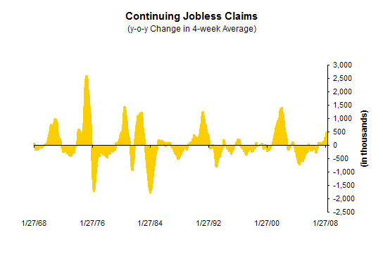
The data show that unemployment is not always a lagging indicator. Sometimes continuing claims jump before the recession actually begins.
Where are we today? +582,000 year-on-year, as of 24 May 2008. Continuing claims went over +200,000 up y-o-y on 22 Dec 2007. So are we in recession today? Sure looks like it.
Sources
A Perfect Recession Indicator, The Big Picture by Barry Ritholtz, 8 Jun 2008
Jobs Show Recession Is Here, Floyd Norris, New York Times, 6 Jun 2008
Unemployment Insurance Weekly Claims Data – Report r539cy, Department of Labor website
Comments are closed.