Pie in the Sky
By Niels Jensen
The Absolute Return Letter, January 2015
“The only function of economic forecasting is to make astrology look respectable.”
-John Kenneth Galbraith
And now for something completely different. You have just started to read the first January Absolute Return Letter. Since late 2003, when it was first published, it has been circulated 10 times a year, usually during the first week of the month with the exception of early January and early August. The latter is obvious, given how many people are away on holiday at that time of year, but we have decided that early January is a good time for a letter despite our scepticism on the wealth of January publications giving a ‘view’ on the coming year.
The aim is to make our January letter an annual statement of sorts – but do not expect it to turn into an archetypal annual forecasting exercise, of which there are so many. This will be a little different and, hopefully, value-added.
It has always baffled me how the financial industry, and financial newspapers in general, in January appear to be hell-bent on forecasting this or that. The amount of forecasts predicting where the FTSE or the S&P will end up in the year ahead is mind-boggling, and quite frankly a little silly. As if anyone knows! My top prize this year for utter silliness goes to this one.
Chart 1: U.S GDP growth versus S&P 500 (1970-2012)

Source: BNY Mellon Asset Managemen
Even worse, the amount of macro-economic forecasts is tedious to say the least. I made the point last month that the link between economic growth and stock prices is pretty much non-existent – at least in the short term. If you don’t recall the chart I used to make my case, here it is again (chart 1).
To exemplify how bad forecasting often is, and just how careful one needs to be if relying on forecasts to construct one’s portfolio, take a look at chart 2 below. As the oil price collapse got more and more pronounced during 2014, analysts didn’t change their future price expectations one iota.
The 3-month and 12-month forecasts were more or less the same premium over the spot price – the starting point (the spot price) just got lower and lower. As Gavyn Davies says, predicting oil prices (or anything else for that matter) can be a mug’s game.
Chart 2: Evolution of Brent oil price forecasts (USD per barrel)

Note: Each line represents the spot price, the 3 month forecast and the 12 month forecast as available on the survey date indicated in the legend.
Source: Financial Times, Consensus Economics.
Our investment style
Having said that, not all forecasting is a waste of time. We make forecasts (!) and have an acceptable track record, but we have some strict rules that we follow which I will get back to in a minute. First some evidence of our record. In March 2004, when the oil price was in the mid-30s, I wrote:
“Oil is essential to everything we do. And because oil is critical to our economy, changing oil prices can have dramatic impact on financial markets. In this month’s newsletter, we will focus on the longer-term outlook for oil prices (we don’t pretend to know what will happen in the short term). Let’s jump to the conclusion right away. We believe we will see $100 per barrel oil prices within 10 years.”
We obviously got the timing terribly wrong. The projected spike in oil prices happened a lot faster than we thought was feasible at the time.
In July 2009 I wrote:
“For all those reasons, I am becoming increasingly convinced that the ultimate outcome of this crisis will turn out to be deflation – not inflation.”
In truth, we were almost alone with that view back in 2009, which can be a terribly lonely feeling, such was the conviction that QE would end up with (hyper) inflation, but we were sufficiently convinced that we called the letter Make Sure You Get This One Right.
A few months earlier – in March 2009 – we had predicted that the aftermath of the financial crisis would be much harder on Europe that on the U.S. (the letter was called Europe on the Ropes). The reality as we enter 2015? All three predictions have been massive winners.
I don’t mention these examples just to blow my own trumpet. The important point in this context, and providing the framework to those rules I mentioned, is that they all have one particular – and very important – feature in common. The reasons behind all these forecasts are structural in nature – not technical or cyclical.
When putting money to work, I am the first to admit that I am pretty lousy at short term investing. The only consolation is, and please don’t be offended, I think most people are. It is no big challenge to make short term profits in a bull market, because the rising tide will lift all boats. It is a great deal more difficult to generate a positive return over the short term when the beta is zero or negative.
I distinguish between three time horizons when investing:
1. Very short term (mostly technical factors)
2. Short to medium term (mostly cyclical factors)
3. Long term (mostly structural factors)
When I speak of technical factors, I am not referring to all those wonderful charts that people create to support their bull or bear case. That sort of technical analysis doesn’t work for our style of investing and I don’t pay any attention. The biggest technical factor for me is the contrarian indicator. If the entire world is negative on asset x, I see it as a major positive. My logic is simple. The vast majority of people are smart enough to position themselves accordingly before they go public with a view. So, when the entire world is already negative, where is the selling pressure going to come from?
This logic unnerves me somewhat as far as my long-standing view on inflation v. deflation is concerned. As already mentioned, when I first went public on the subject in 2009, I belonged to a tiny minority. That is no longer the case. At least as far as the Eurozone is concerned, an ever-growing majority now expects deflationary or near deflationary conditions, which explains why 5-year German notes now offer negative returns and the German 10-year bund now trades around 0.5%.
If you are based in Italy or Greece, and you worry about the risks associated with deflation (which we all now realise are significant after having watched events in Japan over the last couple of decades), and you don’t want to be exposed to currency risk, what do you do? You don’t buy Greek or Italian government bonds. No, you buy German bunds. Using ‘my’ contrarian approach, German interest rates may not have much further to fall (as if they could). Deflationary expectations are now too well entrenched for my comfort.
Chart 3: 2014 total return of various asset classes

Source: Deutsche Bank, Markit, Bloomberg
Another major technical indicator for me is mean reversion, which can be an extraordinarily powerful factor in our industry. If an asset does particularly poorly in one year, it is often near the top the next, making investing ever so easy (just joking). So which asset classes performed the worst in 2014? Oil took the prize with Greek and Portuguese equities in close pursuit (chart 3). A portfolio consisting of those assets would probably do surprisingly well over the next 12 months even if they have few friends at the moment.
Looking at the past, there is no question that we have achieved the best results when we have focused on structural factors and have looked several years ahead. Why is that?
Many investors genuinely believe that it is impossible to look 5-10 years into the future when investing. Too many technical and cyclical factors are likely to derail their strategy, or so the argument often goes.
The effect of this is overcrowding at the near end, making it all the more difficult to outperform near term, while those of us focusing on the long term operate in a far less crowded space, providing us with a comparative advantage. The added advantage, when focusing at the longer term, is that you often have a greater tolerance for volatility.
The rest of this month’s Absolute Return Letter is about which structural factors we focus on now – what are they and how are they likely to impact financial markets over the next several years? Before doing so, I should also point out that it is not the first time I have written about longer term structural factors. Most letters refer to one or more such factors – sometimes explicitly, sometimes less so. In the autumn of 2009 I ran a series of four letters (which you can find here), outlining what I then thought to be the most important structural factors.
Today my list includes – but is not limited to – the following structural factors. They will all be briefly discussed now, but a more elaborate discussion will have to wait. The exception is the price of oil. Given what has happened in recent months, some more in-depth thoughts are pertinent, or so I have decided.
1. The return to fundamentally driven investing.
2. The need for governments to show true leadership and create growth.
3. In a world of managed interest rates, currencies are the primary adjustment factor.
4. The end of cheap oil.
5. The aging of people in the mature world.
6. The ‘demise’ of the Anglo-Saxon consumer-driven growth model.
7. The financial crisis: The end game
The return to fundamentally driven investing
QE has changed the dynamics of investing. The obvious one is fixed income investing, but it doesn’t stop there. Because investors are now earning such petty returns on bonds, much capital has been re-directed towards equities (and other asset classes as well), driving valuations higher. Nowhere has this been the case more so than in the U.S. equity market, where the market P/E is hard to justify on earnings alone.
Obviously QE will not last forever. The Fed has already more or less ended its programme, and although Europe is way behind in the recovery phase (we expect plenty more easing by the ECB in the short term), it will happen eventually. The big question is what will happen to bond prices when central banks are no longer a significant buyer? I still think inflationary pressures will remain very modest, suggesting low interest rates for quite some time to come. (In chart 8 you can see how big a share of the local bond market the most important central banks control).
Regardless of this projection, with no QE to beef up prices, at least in the U.S., investors are likely to pay increasing attention to fundamental factors. As I have argued over the past few months, a return to fundamentally driven investing is likely to happen at a time when those fundamentals are not the most promising I have ever come across. We have entered a period (I believe) of below average economic growth and therefore also a period of disappointing earnings growth for many companies, limiting the upside potential on shares, but don’t ignore my earlier comments about the missing connection between economic fundamentals and equity prices in the short term.
We still expect equity returns to be positive over the next several years but, on average, would expect returns to be mid-single digit, not high-single digit as we have grown accustomed to since the start of the great equity bull market in the early 1980s.
Because economic growth is likely to disappoint, investors should remain only lukewarm on cyclical companies and they will almost certainly pay more attention to dividends than they have done in recent years. This was all discussed in the December 2014 Absolute Return Letter.
Given the ‘damage’ QE has done to valuation levels, as the market returns to a more fundamental approach, we can see that our high quality approach to equity investing is working quite well. Likewise I wouldn’t be surprised to see value stocks begin to outperform growth stocks again.
The need for governments to show true leadership and create growth
As we enter an era of low economic growth, the onus will increasingly be on governments to create growth, as they can do like nobody else (without trying to sound like Larry Summers). This is stuff for a future Absolute Return Letter, so I shall restrain myself from going into too much detail. Suffice to say that there is good and there is bad government spending. Infrastructure improvements which will improve overall productivity is good government spending, and both the UK and the US could do with some of that.
We have learned from Japan over the past couple of decades that investors may be prepared to accept debt-to-GDP levels significantly higher than what pretty much anyone thought was acceptable, so investors are not likely to bark too loudly anytime soon, as long as interest rates remain relatively benign.
The other interesting aspect, from a very selfish point of view, is that many of the investment opportunities in this particular area may be constructed as alternative. I can’t wait!
One final comment: This theme also implies a shift from small to big(ger) government with all the implications that follow, which will probably go down better in Europe than it will in the U.S., but more about this over the next few months.
In a world of managed interest rates, currencies are the primary adjustment factor
I have written about this before, so no need to go into too much detail. The point is the following: When interest rates are managed (some say manipulated), markets are efficient enough to make the necessary adjustments elsewhere and, in this context, currencies play an important role. If one economy outperforms another (e.g. the U.S. outperforms Europe as is presently the case) but interest rates in both areas remain ‘managed’, the currency of the better performing country will simply outperform the currency of the weaker one (as USD presently does vis-à-vis EUR), in effect doing the job that the bond market would have done under normal circumstances.
Having said that, this adjustment mechanism doesn’t work very well in countries where the bond market is almost entirely controlled by domestic investors to whom changes in the exchange rate won’t have the same behavioural effect, which explains why it has never worked in Japan.
With this in mind, I find it difficult not to maintain my long-term bullishness on USD/EUR, despite the U.S. dollar’s recent gains. Current U.S. economic activity is too high to justify the low level of interest rates over there, and currency markets are likely to make the adjustments that politicians/central bankers are not willing to do.
The end of cheap oil
Woody Brock inspired me to add this theme to my list of longer-term structural trends all the way back in 2004 when the oil price was in the low to mid-30s. Note that it is fundamentally different from the widely acclaimed theme known as Peak Oil, the consequence of which is that oil production will be in terminal decline once production has peaked. Woody’s (and, since 2004, my) philosophy is that oil won’t run out anytime soon, but the price will be altogether different from the price the world got used to until relatively recently. I will dedicate more space to a review of this theme than to any of the others, because of what has recently happened to the price of oil.
Shortly before Christmas Woody spent a morning with us in the office, and he convinced me yet again that, despite the recent turmoil in global oil prices, nothing has fundamentally changed. The world will still run out of cheap oil (cheap as in approx. $25 per barrel of production cost, as is currently the average production cost in the Middle East) over the next decade or so. It is hard to predict exactly when, because OPEC members are not the most informative people in the world.
Chart 4: U.S. shale is changing the dynamics of oil

Source: Econbrowser. Vox.com
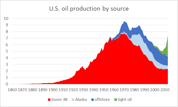
Following six months of near constantly falling oil prices, you are probably surprised to see this on my list in the first place. After the shale (fracking) revolution, how can I seriously suggest that energy supplies are dwindling? When I first predicted the oil price to go to $100 in 2004, I hadn’t even heard of fracking, and nor had most other people. However, after years of massive investment, primarily in the U.S., shale has tipped the supply/demand balance.
Take a look at chart 4 above and pay particular attention to the green line on the extreme right. Most of what is named ‘tight oil’ in the U.S. is shale, and production has risen by almost 4 million barrels per day (mpd) since 2008. In effect, OPEC is trying to destroy the economics of this industry, which admittedly requires quite high oil prices to remain profitable.
However, only 4% of total U.S. shale production breaks even at $80 or higher[1]. A high percentage of the industry breaks even with an oil price in the $55-65 range. What happens next is anyone’s guess, though. It is now a highly political chess game and, as I have learned over the years, when politics enter the frame, logic goes out the window.
OPEC (with Saudi Arabia in the driving seat) may exhaust itself and decide that enough is enough, or it may go for broke – in this case it would want U.S. shale producers to go bankrupt and exit the industry forever which, we note, is quite likely to happen, should the oil price stay at current levels or lower for any extended period of time. The U.S., on the other hand, will obviously benefit from lower oil prices despite its growing shale production. Consumers will benefit immensely, as will most of the rest of the country.
A number of U.S.-antagonistic countries around the world (think countries like Russia, Iran and Venezuela) will be seriously weakened as a result of lower oil prices, which will strengthen the position of the U.S. in global politics. At current oil prices, Russia alone stands to lose in excess of $100 billion annually in export revenues – an amount they can hardly afford. Who will give in first? I have no idea.
The point missed by most people in this quite fascinating chess game is that even modest changes in the balance between supply and demand can have a dramatic impact on price, provided demand for, and supply of, the commodity in question is inelastic, and that is precisely the case as far as oil is concerned.
Chart 5: A significant excess of oil supply has opened up

Source: Vox, IEA
In September 2009 I wrote about this topic for the first time (see here). Higher supplies, mainly as a function of U.S. shale, combined with (modestly) weaker than projected economic growth in some parts of the world (e.g. Europe) have created an imbalance, and the price has behaved exactly like the textbook prescribes (chart 5).
So what precisely does the textbook prescribe? In chart 6a below I have provided a graphical illustration of the effect on price, should demand for a ‘normal’ commodity change modestly. In chart 6b you can see the effect the same level of demand change has on price, assuming now that both supply and demand are inelastic (both the supply and demand curves are now much steeper).
As mentioned, oil is widely known to be a very inelastic commodity, which explains precisely why the oil price has fallen so dramatically in recent months. The recent collapse in the price of oil has nothing to do with the global economy going into another tailspin like the one in 2008[2] as some have argued.
As already mentioned, it is my belief that the era of cheap oil is coming to an end, even if recent price behaviour suggests otherwise. Shale is a relatively short-lived phenomenon. It is as much a political statement as it is a commercially viable endeavour on a grand scale. It is therefore hard to predict how various governments will react, should the oil price remain below the break-even for shale for any sustained period of time. They could possibly discontinue any effort to become an oil/gas producer, but they could also decide to bite the bullet.
Chart 6a: Price behaviour assuming normal elasticity

Chart 6b: Price behaviour assuming inelastic supply and demand

Source: www.SEDinc.com
All I know is that the price of oil won’t stay below the production cost for a long period of time (as in years). Hence I think we will see the oil price at $100 again, and it won’t take many years, but it could be an extraordinarily bumpy ride.
In the meantime, prepare yourself for a few accidents. With an oil price around $50, oil producers could go belly up, left right and centre, and it is worth noticing that U.S. high yield indices are full of below investment grade oil producers. These indices are therefore also likely to take a beating – even more so than they already have.
The aging of people in the mature world
I have written extensively about demographics in the past, so only a few comments at this point. The struggle has only just begun. We live in a time where the number of elderly is about to grow explosively and, while many countries will not experience the peak of the problem until after 2030 (chart 7), you will be mistaken to think that you don’t have to worry about it yet.
Chart 7: Old Age Dependency Ratios for Selected Countries

Quite a few European countries will see a substantial increase in the old age dependency ratio between 2020 and 2030. In Germany, for example, it will jump from just under 36% to over 47%[4]. Such a drastic increase in the number of elderly will have a dramatic effect on everything, and it is only just beginning.
In the world of mature economies, the U.K. and the U.S. will suffer the least from aging. Only emerging market countries are in better shape, but don’t assume everything is fine in China. It is actually in a worse condition than both the U.K. and the U.S. Don’t buy China because you think that demographics are not going to hurt them.
Demographics represent the single most important structural trend that we are faced with today, and it will have a massive impact on everything – economic growth, interest rates, public debt, stock markets, etc. etc. One of the most important repercussions is the effect it will have on our pension system. Unfunded pension liabilities fast approach £10 trillion in the UK (annual UK GDP was about £1.86 trillion last year, so the number is enormous), and younger people today had better get used to the fact that they won’t receive the pension entitlements that they have been promised. The government simply cannot afford to pay out, but nobody wants to start the politically necessary discussion, as it is most certainly not a vote winner.
The solution is as simple as it is unpopular. Convert all defined benefit schemes to defined contribution schemes, and introduce an across-the-board haircut in order to eliminate the funding deficit once and for all. It is quite obviously the most equitable solution. Probably change the pension age as well. When the present system was designed, people were expected to live no more than 8-10 years once retired. Today they live (and claim pension payments) for another 20-25 years, and entire countries are in trouble as a consequence. But, knowing politicians, things have to get a great deal worse before a solution is found.
This dynamic is likely to keep interest rates relatively low for much longer than nearly anyone expects, but more about this in a future Absolute Return Letter.
The ‘demise’ of the Anglo-Saxon consumer-driven growth model
The consumer very much dominates the U.K. as well as the U.S. economy – in fact so much so that it is the consumer more than anything else that dictates the direction of the economy in those two countries. Consumer spending in the U.S. accounts for nearly 70% of GDP, whereas the same number in the U.K. is in the mid-60s. By comparison, in Germany, which is known for its much more restrained consumers (which is not inevitably bad), consumer spending as a % of GDP is only in the mid-50s.
Two dynamics will reduce the impact of the consumer in the Anglo-Saxon world over the next several years – demographics (as already mentioned) and debt levels which are worryingly high in the household sector. I will return to this subject in a future Absolute Return Letter, but don’t despair. An economy not so dependent on the consumer is not necessarily a bad thing. More about this later.
The financial crisis: The end game
I have an odd feeling, and I may be quite alone on this one, that the financial crisis is not over yet. Somehow, somewhere, another leg to this crisis will pop up before we can well and truly say that the 2008-09 crisis is (finally) behind us and we can move forward, or so I think.
Greece appears to be on everybody’s lips again. Could Greece possibly be responsible for a re-run of 2008-09? I somehow doubt it. Crises rarely begin with something predicted by nearly everyone, and I suspect the EU will have learned its lessons, should Greece drop back into the crisis zone.
Having said that, Greece is no longer in control of its own destiny. 80% of its government debt is now in the hands of international organisations like the IMF and the ECB (chart 8), which would make it quite easy to take effective control, even force Greece to exit the Eurozone, should it be required.
Chart 8: Holders of government debt (as at end of 2013)

Source: Deutsche Bank, Arslanalp and Tsuda
And precisely that may actually happen. Mrs. Merkel has recently changed the rhetoric on Greece. She is now more open to a Greek exit from the Eurozone than she has ever been before, significantly weakening the Greek hand (see here). Having said that, a Greek exit would almost certainly be far less dramatic than 5 years ago.
A more likely ‘crisis candidate’ in my book is all the borrowing in emerging markets which has taken place in the last few years in USD under the assumption that the Fed will keep the policy rate very low. It may do, but the borrowers may still be crucified as a result of the rising U.S. dollar. To put the problem into context, total USD borrowing in emerging markets has tripled in the last 10 years to $5.7 trillion, $3.1 trillion of which are bank loans and $2.6 trillion bonds. These numbers are staggering and the effective rise in interest rates as a result of the stronger USD significant[5].
Much of this debt has been established at a significantly lower dollar exchange rate (chart 9), and the recent strengthening of the dollar is akin to a massive increase in the rate of interest which could completely wipe out many borrowers.
The optimists say that little of this borrowing is sovereign but, in response to that, I say that Russia won’t kill Gazprom and Brazil is equally unlikely to let Petrobras go, in effect turning much of this debt into de facto sovereign debt (Gazprom and Petrobras are two of the largest USD borrowers in emerging markets today).
Chart 9: EM currencies are back to their 2002 lows

Note: Based on EM currencies against USD.
Source: Daily Telegraph, JP Morgan, SG Cross Asset Research
I should also mention my favourite outside candidate for further European turmoil – the forthcoming EU referendum in the UK. I do not for one second expect the UK to be big enough or important enough to put the entire EU project directly at risk, should it decide to exit the union in the referendum planned for 2017. However, the important point here is that no country has ever left the EU, and a British exit could create much momentum for anti-EU parties in other northern European countries such as Sweden, Denmark or the Netherlands. And if at least part of the wealthy North decide to follow the British example and exit the union, the EU could be history – at least as we know it today.
Concluding remarks
I said at the start of this letter that the annual swathe of New Year forecasts are tedious, mind-boggling in their quantity and often downright silly. Anyone investing on the back of most of these forecasts may as well stroll down to the local roulette table. Yet it would appear that I have done a fair bit of forecasting myself. However, in my defence, I at least try to take the roulette out of investing. Every sensible investor has to have a view from which to develop an investment strategy.
My point is quite simply that the smart investor will take the long term outlook in mind. Our needs are long term and will be affected ultimately by how structural trends play out. Only by trying to make sense of the long term outlook can we understand how to develop an investment strategy that is fit for the future.
So where does all of that leave us? How will equities perform this year and will interest rates go up or down? I wish I knew but I don’t, but I can say the following:
We are still in a post-crisis environment, and enough people are still negative on equities, and interest rates are low enough, to provide plenty of purchasing power. We therefore expect it to be an ok period for equities over the next year or two – not outstanding given our modest growth expectations but ok. The trick is to be careful on emerging markets. If the U.S. dollar continues to be strong, it is an accident waiting to happen.
Interest rates will continue to stay relatively low, but the pressure on various central banks – in particular the Fed – to increase the policy rate is rising, and I expect the Fed to begin a cycle of higher rates relatively early this year. Most other central banks will stay put in 2015. The USD is likely to remain strong throughout the year.
The star performer this year could very well be oil, but expect an exceedingly bumpy road ahead and don’t be surprised if it touches $40 (even $30 is possible) before it resumes its journey north.
Finally, we expect some, but far from all, alternative strategies to perform (very) well in this sort of environment. Rules prevent me from being more specific in this forum, but feel free to call if you wish to learn more.
Have a pleasant and hopefully successful 2015.
Niels C. Jensen
9 January 2015
©Absolute Return Partners LLP 2015. Registered in England No. OC303480. Authorised and Regulated by the Financial Conduct Authority. Registered Office: 16 Water Lane, Richmond, Surrey, TW9 1TJ, UK.
Important Notice
This material has been prepared by Absolute Return Partners LLP (ARP). ARP is authorised and regulated by the Financial Conduct Authority in the United Kingdom. It is provided for information purposes, is intended for your use only and does not constitute an invitation or offer to subscribe for or purchase any of the products or services mentioned. The information provided is not intended to provide a sufficient basis on which to make an investment decision. Information and opinions presented in this material have been obtained or derived from sources believed by ARP to be reliable, but ARP makes no representation as to their accuracy or completeness. ARP accepts no liability for any loss arising from the use of this material. The results referred to in this document are not a guide to the future performance of ARP. The value of investments can go down as well as up and the implementation of the approach described does not guarantee positive performance. Any reference to potential asset allocation and potential returns do not represent and should not be interpreted as projections.
Absolute Return Partners
Absolute Return Partners LLP is a London based client-driven, alternative investment boutique. We provide independent asset management and investment advisory services globally to institutional investors.
We are a company with a simple mission – delivering superior risk-adjusted returns to our clients. We believe that we can achieve this through a disciplined risk management approach and an investment process based on our open architecture platform.
Our focus is strictly on absolute returns and our thinking, product development, asset allocation and portfolio construction are all driven by a series of long-term macro themes, some of which we express in the Absolute Return Letter.
We have eliminated all conflicts of interest with our transparent business model and we offer flexible solutions, tailored to match specific needs.
We are authorised and regulated by the Financial Conduct Authority in the UK.
Visit www.arpinvestments.comto learn more about us.
Absolute Return Letter contributors:
Niels C. Jensen
Gerard Ifill-Williams
Nick Rees
Tricia Ward
[1] Source: Bloomberg
[2] I have borrowed the charts from a Woody Brock paper from 2009. At the time, oil prices were rising which explains why charts 6a and 6b illustrate how a modest increase in demand can result in a dramatic increase in price. Rest assured – the dynamic works both ways!
[3] I created this chart back in 2009 when I first wrote extensively about demographics. I have been searching like mad for an update but cannot find it anywhere. The cynical side of me thinks that someone high up has decided not to publish these numbers anymore, because they paint too grim a picture.
[5] Source: The Daily Telegraph. See also this article in The Financial Times.
Comments are closed.